
I am committed to excellence in every aspect of my artistic practice, driven by a deep dedication to exploring and challenging the boundaries of perception and social impact. My mission is to create thought-provoking art that not only reflects but also shapes the complex dynamics of our collective human experience. By merging rigorous craftsmanship with innovative ideas, I strive to inspire meaningful dialogue and transformation.
Black on Black Series
The Black on Black series explores the intricate dynamics of class, race, and identity through an examination of systemic behavior and the consumption and accumulation of ideologies within contemporary American society. Utilizing monochrome as a medium, this series investigates the sublime, drawing on Immanuel Kant’s concept that the immeasurable vastness of the sublime challenges and surpasses individual perception, thereby revealing the diversity within the singularity of black.


In this body of work, the monochromatic black field is employed to symbolize the infinite and the sublime, juxtaposing with the finite and the structured. This approach highlights the duality inherent in human experience and questions traditional notions of identity and systemic structures. Originating during my master's program at Tufts University in conjunction with the School Museum of Fine Arts Boston, the series was distinguished with the Dana Pond Award for painting, a recognition that signifies both artistic excellence and service to the field.
This series serves to critically examine public policy and its impact on perception, inviting viewers to engage with the ideologies that shape our understanding of race and identity. By focusing on monochrome and minimalism, the Black on Black series also reflects a critical examination of the New Realism of the every day, offering a conceptual approach where the artwork emerges from the interplay of ideas rather than traditional artistic techniques.
Signs & Symbols
‘1 out of 5 or 4 out 5’
My piece ‘1 out of 5 or 4 out of 5’ challenges the internet's culture of rapid judgment and the precarious nature of perception, highlighting how good and bad coexist at all times. It critiques the superficiality of online ratings, where opinions are often formed with limited information, leading to potential misinterpretations. I encourage viewers to consider how personal experiences and knowledge—or the lack thereof—shape our judgments. By highlighting the ambiguity between a low and high rating, I underscore the tension between subjective perception and objective reality in the digital age.
‘Amplify’
‘Amplify’ is a vibrant exploration of the intersection between social and financial capital, represented through a rich palette of nearly 70 colors and a complex system of Signs & Symbols. Building on the principles established in ‘Divided We Stand’, this 5’X5’ piece studies the transformative power of networks, where the multiplication symbol becomes a metaphor for converting social connections into financial assets.
In ‘Amplify’, I examine how perception shapes our understanding of these networks and their potential. The work reflects on the duality inherent in navigating both familiar and unfamiliar structures to achieve prosperity as a necessity. The Signs & Symbols used as a visual language underscore this duality, revealing how networks can simultaneously sustain and expand opportunities. By exploring the duality of these systems — how they can be both familiar and enigmatic— ’Amplify’ resonates with the complexities of the contemporary experience, highlighting the nuanced interplay between perception, opportunity, and capital.
This work was a private commission I worked on during my artist residency at Zero Bond in 2020, a private membership club, that features various blue chip artists from Banksy to Francesco Clemente.
‘Divided - We Stand’
In ‘Divided We Stand’, I examine the delicate balance between unity and division, using a diagonal division symbol to bisect the composition. The 86 different colors in the palette, ranging from skin tones to analogous colors, masculine to feminine tones, and complementary hues, serve as a metaphor for the diversity and complexity of our shared human experience. Each color, distinct in its own right, forms part of a harmonious composition, challenging the notion that things that don’t seemingly belong together can’t work in unison. This interplay of contrasts underscores the notion that disparate elements, though seemingly at odds, can coexist and even thrive together. The piece reflects on the paradox of division embodying the checks and balances of opposition and reflecting the duality that underpins our perceptions.
The piece’s imposing scale, at 6 feet by 8 feet, dwarfs the viewer, challenging preconceived perceptions and inviting a more immersive engagement. This monumental size forces the viewer to confront the tension between unity and division on a personal level, emphasizing how disparate elements, though seemingly at odds, can coexist and even thrive together. How separation often reveals underlying connections, and how disparate elements, when viewed together, can create an unexpected and profound sense of balance. This work is a meditation on the possibility of harmony amidst difference, the power of color to transcend boundaries, both literal and figurative, forging unity within diversity.
‘Signs & Symbols’
At Jason Wallace Studio, my "Signs and Symbols" series delves into the intersection of mathematical notation and human geometry, exploring how these symbols act as metaphors for our interactions and perceptions. By integrating mathematical signs into my work, I aim to illuminate the fluidity of human perception and the dynamic nature of our exchanges.
In our daily interactions, there are moments of equal exchange, where information flows seamlessly and individuals stand on equal footing. However, there are also times when the balance shifts and one must strategically position themselves to achieve their goals. This positioning often requires a deep understanding of the dynamics at play and the symbolic language that governs our exchanges.
Through my use of signs and symbols, I explore these shifting dynamics, illustrating how perception can be both fluid and multifaceted. My work captures the essence of human geometry — how our positions and perceptions evolve based on the information we seek and the understanding we need to navigate our interactions. In doing so, I invite viewers to consider how the symbolic language of mathematics can offer insight into the complexities of human relationships and the ever-changing nature of perception.

In conceptual art ideas create art, as opposed to the artist.
Thomas McEvilley in ‘The Exiles Return’ writes, “A sublime art could function in other words, as a channel leading from every day toward the beyond, toward the infinite which is the death of the self and the destruction of the finite universe of form.” In concord, Immanuel Kant wrote the sublime is that which, by its immeasurable vastness and uncompromised otherness, dwarfs and threatens to extinguish the realm of the individual. These concepts both deal with the one within the vastness, and yet the vastness within the one.
My interest in minimalism is obvious in this work through using serial symbols and examining the New Realism of the everyday. The element of the everyday intrudes into the white cube of art with historical reference to Jasper Johns’ target paintings reducing the concept further. Taking away the action of the arrows still in a conversation about the gaming system of competition with a specific objective and using color as a signifier of race allows the viewer to be the movement through questioning and examining closer.
The Life & Luxury Series
The ‘Life & Luxury’ water series delves into the complex symbolism of water as both a fundamental life source and an emblem of privilege. By titling each piece ‘Reflection’, I aim to evoke the literal image of water’s surface while also engaging with a metaphorical reflection on humanity. The physical reflection in water symbolizes purity, clarity, and the fluidity of life, yet the series also calls attention to the ethical and societal implications of water becoming a luxury. These works invite viewers to confront the inequities surrounding access to this essential resource and reflect on our collective responsibility. The ‘Reflection’ is about water’s role in sustaining life and the deeper self-examination required to understand how we, as a society, have allowed a life-giving necessity to be commodified, revealing the disparities that shape our world.
In this series, silver leaf banding serves as a visual metaphor for the disruption caused by industrial metals contaminating the natural flow of water. The silver leaf creates tension within the composition, as it interrupts the organic, fluid nature of the water, forcing the viewer to grapple with the shifting relationship between foreground and background. This visual dissonance mirrors the tension inherent in the water crisis itself, where a life-sustaining resource has been tainted by pollutants, complicating what should be a clear, accessible element of life. The reflective quality of the silver leaf also echoes the series' theme of ‘Reflection’, inviting the viewer to consider both the physical contamination of water and the moral corrosion within society that allows such injustices to persist.
‘Community’

Acrylic on paper. 30”x40”. 2025.
‘Community’ is a work from my Signs & Symbols series, featuring 56 distinct skin tones arranged in a neutral color palette. It employs a mathematical symbol to explore human geometry, with a pronounced X acting as a unifying element across the composition.
The juxtaposition of skin tones invites contemplation on interconnectedness—how we exist in service to one another through shared experiences and correlation. The piece naturally engages the viewer’s eye, as one instinctively searches for familiar colors, only to discover similarities and differences along the way.
At its core, this work touches on the sublime, illustrating how the individual is part of the collective, and how, psychologically, the many ultimately point back to oneness.
‘Ever Forward: In the Light’
The Ampersand, the Arrow, and the Anatomy of Persistence
‘Ever Forward’ is a continuation and deepening of the themes introduced in ‘The Constant Pursuit’, where the target served as a symbol of focus, aspiration, and tension between mastery and failure. In this new body of work, the visual language expands to include the ampersand (&) and the arrow (→) symbols that speak to the power of persistence, fluidity, and the complexity of emotional and experiential states.
While ‘The Constant Pursuit’ centered on the idea of striving and the psychological relationship between self and goal, ‘Ever Forward’ moves into the terrain of motion, an exploration of what it means to continue despite disruption, contradiction, and emotional turbulence. The ampersand represents multiplicity, the holding of contradictions, the refusal to collapse experience into either/or categories. It implies continuation, elasticity, and endurance. The arrow suggests direction, progress, and agency even when fragmented, redirected, or subtle in its appearance.
These symbols serve not only as design elements but as conceptual anchors. Often overlooked in its ubiquity, the ampersand becomes a metaphor for emotional complexity for the simultaneous existence of joy and grief, doubt and conviction. Traditionally signifying linear movement or goal orientation, the arrow is recast here as a symbol of resilience. Its presence signals forward motion not in terms of perfection or clarity, but as a commitment to keep moving despite uncertainty or uneven terrain.
This series operates within a language of persistence, where repetition, gesture, and abstraction articulate the labor of staying in motion. Unlike traditional narratives of success or mastery, ‘Ever Forward’ acknowledges that progression often includes deviation, fracture, and emotional multiplicity. Movement, in this context, is not always graceful or triumphant. It is often quiet, subtle, even ambivalent, but still, it is movement.
Visually, the work builds on the systemic structure and restraint of ‘The Constant Pursuit’, but allows for new formal ruptures and visual interruptions. The target in the earlier series functioned as a visual metaphor for the orientation of perception, where one’s position in relationship to the symbol affected the interpretation. In ‘Ever Forward’, that perception shifts again, this time toward temporal and emotional navigation. The symbols here are not fixed destinations, but wayfinding tools. They help mark the landscape of becoming, of continuation, of carrying on.
This body of work also contemplates emotional endurance, how individuals negotiate forward motion through shifting psychological and material conditions. It suggests that resilience is not a singular event, but a continual negotiation of internal and external variables. The ampersand and arrow are not resolutions; they are acknowledgments of ongoing processes. They speak to adaptation, expansion, and the ability to hold complexity while staying in motion.
Ultimately, ‘Ever Forward’ proposes a visual and conceptual vocabulary for navigating the present; a present that is fractured, overlapping, and nonlinear. It does not promise clarity, but insists on continuation. It moves, always, with and through yet never despite.
The color palette in ‘Ever Forward: In the Light’ draws conceptual and aesthetic influence from the chromatic strategies of Josef Albers, particularly his disciplined exploration of relational color. Much like Albers, who used repetition and variation to investigate perception and optical shifts, this series employs color not as background or embellishment, but as a structural element in its own right, inviting the viewer into a slow, attentive engagement with surface and form. The palette builds directly on the tonal language developed in ‘In the Light’, a previous painting that introduced gradients of warmth, muted saturation, and subtle contrast to evoke the emotional dimensions of clarity, transition, and vulnerability.
In ‘Ever Forward’, color becomes a vehicle for emotional movement, quietly modulating the spatial and symbolic relationships between the ampersand, the arrow, and the field they inhabit. Pale earth tones, warm grays, and desaturated primaries serve as the grounding base, while small, intentional interruptions of high-chroma color act as moments of disruption or acceleration. This restrained yet resonant palette reinforces the series’ core inquiry: how to move forward not through force, but through calibration, through sensitivity to what is felt just as much as what is seen.
‘Ever Forward: In the Light’. Acrylic on a linen panel. 21’x25”. 2025. © Jason Wallace Studio
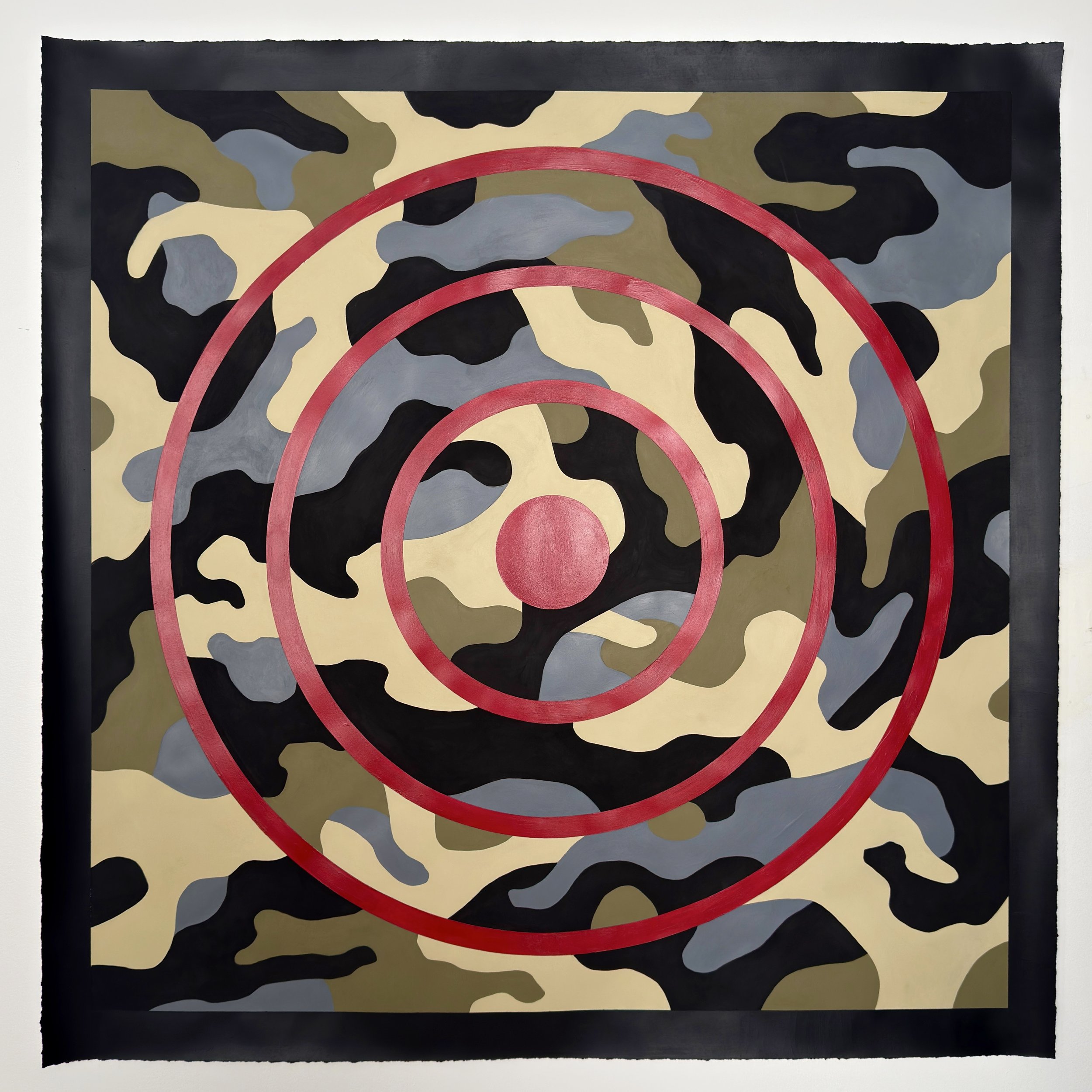
The Constant Pursuit
Hidden in Plain Sight
This work from The Constant Pursuit examines how clarity of purpose is increasingly challenged by systems that obscure truth. Camouflage, traditionally used to conceal and misdirect, becomes a metaphor for the ways narratives are constructed, layered, and manipulated to create distraction and fear. Within this shifting field, the target remains deliberately legible.
The target is not abstracted beyond recognition because its role is intentional. It functions as a point of orientation, asking viewers to consider where they stand in relation to their own purpose. In a time when truth is often obscured, and attention is diverted to competing interests, the work poses a central question: Are we acting in alignment with our values, or operating within objectives imposed by others?
This piece arrives at a moment that calls for discernment and action. It acknowledges the forces that attempt to destabilize focus while insisting that clarity is still possible. The work invites viewers to resist confusion, confront their fears, and make conscious decisions about where their energy, attention, and agency are directed.
As the first completed work of 2026, The Constant Pursuit - Hidden In Plain Sight, signals a continued commitment to examining perception, power, and the quiet discipline required to remain oriented toward purpose in uncertain times.